
The colours of 2027: which tones will lead in paper and print?
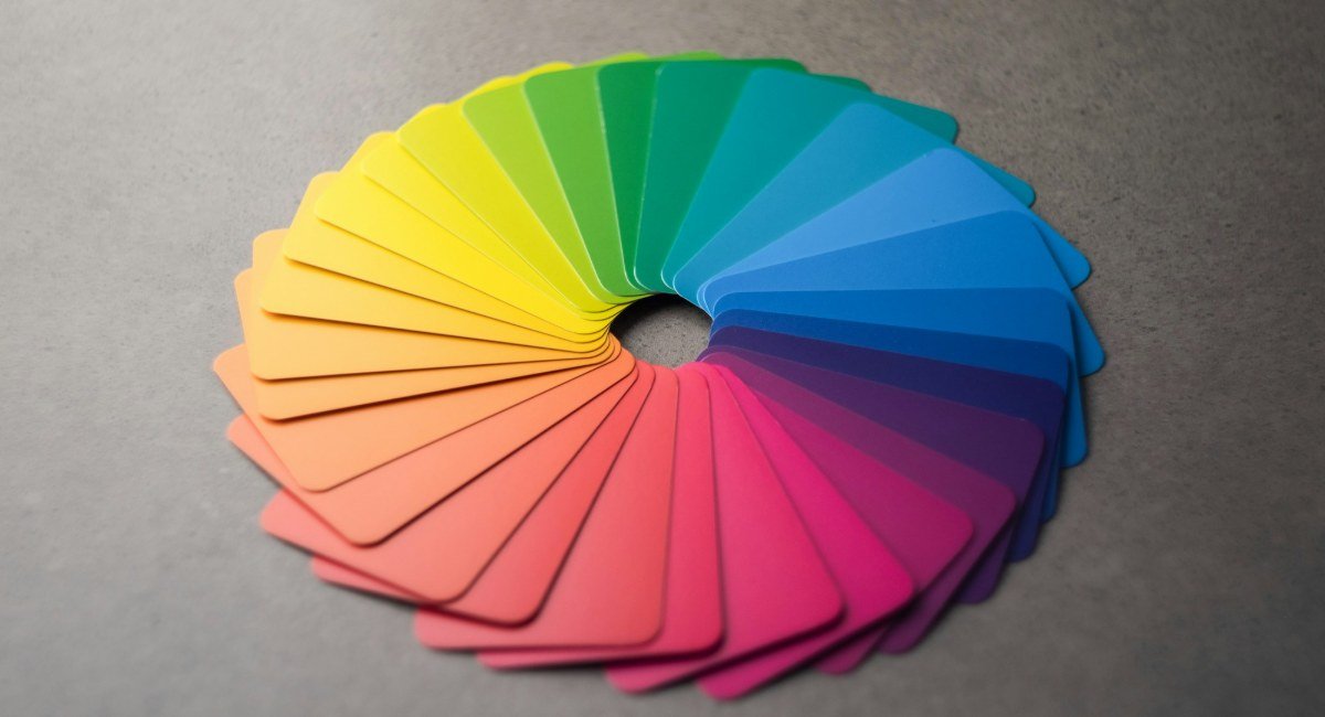
Every year in early December, designers, packaging producers and print shops wait for the same news: Pantone announces its Color of the Year. As of early November, Pantone's 2027 choice has not been revealed, but trend forecasters and paint brands have already shown theirs. Together they give a good hint of how next year's invitations, packaging and print jobs will look.
What happened in 2026?
Pantone chose Cloud Dancer (PANTONE 11-4201), a very light off-white, as its 2026 colour. It was the first time a shade of white had been named Color of the Year, reflecting the interest in calm, clean design.
What do we already know about 2027?
Trend forecasters WGSN and Coloro named Luminous Blue, a vivid, glowing blue, as their Colour of the Year 2027. They also listed five key colours for spring/summer 2027:
- Luminous Blue
- Energy Orange
- Pop Pink
- Meadowland Green
- Clay
Paint brands have gone calmer. Sherwin-Williams chose the soft green Celery, Dulux the sage tone Soulful Sage, and Benjamin Moore Webster Green. So two directions are visible: bright, energetic colours on one side, and greens and earth tones close to nature on the other.
What do these trends mean for print?
- Get bright colour from the paper itself. A solid blue or orange background can be costly to print and may crack on the fold. Coloured paper reduces this problem.
- Standard printing is not enough on dark paper. Ink is transparent, so it takes on the paper's colour. On dark blue or green paper, foil stands out far more clearly.
- Choose texture for natural tones. Green and clay shades look richer and more natural on textured paper.
- Check light tones on paper. Off-whites look different on screen and on paper. Always make the final decision from a real sample.
Where can you use them?
Trend colours appear most often in invitations, business cards, corporate stationery and gift packaging. The safest approach is to pair one trend colour with a classic tone, such as luminous blue with white, or clay with cream.
Conclusion
Pantone will reveal its choice in December, but the main direction for 2027 is already clear: vivid blue, natural green and earth tones. At Printshop you can browse a wide range of coloured papers in our sample book and choose the right tone on real paper.